The thing about billboards is that despite their gigantic size, they are easy to miss. Few of us pay attention to advertisements and hoarding on the side of roads or highways, mainly because there are simply too many to look at. By the time we have moved on to a second ad, we forget the first one. This makes it more vital than ever for brands to come out with advertisements that can hold their viewers’ attention.
The average attention span of a human being is eight seconds. It goes without saying that is too little time to get the message across – but not for these companies. These brilliant minds put together some of the most engaging billboards ever, and they reaped the benefits too.
This article was originally published on avocadoposts.com and has been republished here with permission.
Nationwide Insurance
Sometimes, the advertisement does not have a direct connotation to the product. So, believe it or not, paint is not the subject of this billboard. This advertisement is taken from Nationwide Insurance’s creative marketing campaign with the slogan “life comes at you fast.” The billboard uses an interesting analogy to drive the message across. As we can see, the neon green paint flows off the billboard, splattering everywhere.
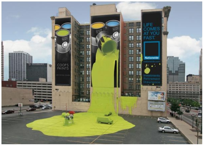
The positioning of the billboard was clever too. It would not have worked if it were a simple structure. Paint spilled from the cans and washed along the parking lot, covering a few cars too.
Allstate Car Insurance
It seems like insurance companies are coming up with unique advertisements, and this one is a personal favorite. From afar, this billboard may give anyone a shock. The white car dangling from the floor looks like it can crash against the ground at any moment. A blue banner under it reads, “Are you in good hands?” From the looks of it, the owner of this vehicle is surely not in good hands. Perhaps considering Allstate Car Insurance might provide them better backup.
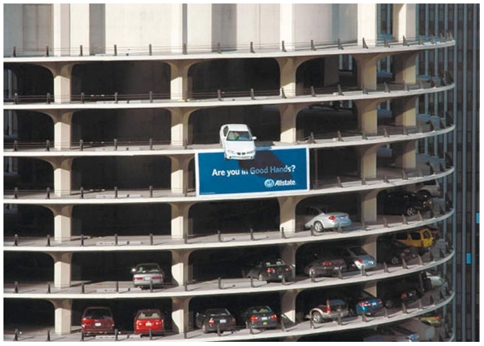
Marina Tower parking lot got an interesting touch ever since this ad was placed. We love the 3D aspect of this billboard – it appeals to numerous senses with a simple design.
Formula Toothpaste
This billboard was designed to showcase the benefits of Formula Toothpaste, advertising the strengthening benefits. Instead of the generic toothpaste marketing campaigns involving an attractive model flashing their pearly whites at the camera, this advert is something unique. The brand wants consumers to focus on how toothpaste can make their teeth stronger and healthier. Thus, they show a man with supernaturally strong teeth. His jaws are so strong he can pull the advertisement from the metal structure.
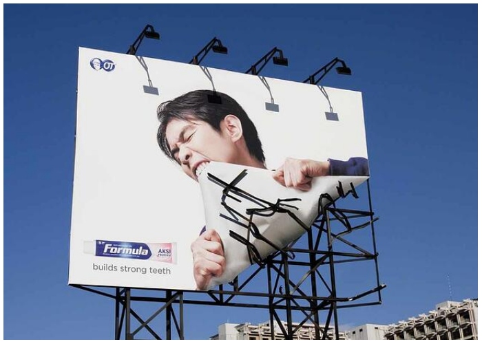
“Builds strong teeth” is the brand’s slogan. Whoever came up with the design surely encapsulated the brand’s essence into the campaign. A wonderful job done.
Oldtimer
Cross-country road trips would not be complete until we see at least 10 billboard advertisements. Highways are one of the best ways to advertise products as a huge volume of vehicles constantly move on them. However, when we are speeding on the highway, we seldom stop to look at the advertisements – no matter how unique they seem. But safe to say, people cannot ignore this one. Anyone zooming through Austrian tunnels will come across this billboard.
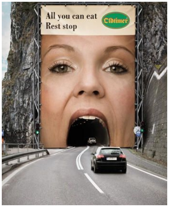
Oldtimers is a rest stop offering all-you-can-eat meals for customers. Anyone who sees this giant poster of a woman with her mouth open might start feeling hungry too.
Tylenol
We are all familiar with Tylenol. It is our most trusted companion when we feel like our head is splitting into two. The popular acetaminophen tablet is powerful enough to soothe mild to moderate pain, from toothaches to menstrual pain and headaches. Of course, their primary area of focus is headaches, and this advertisement displays that perfectly. It shows a massive wrecking ball crashing against a man’s head as he sits there frowning with his hands on his head.
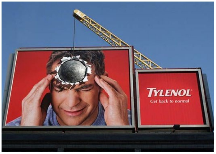
This wrecking ball is figurative to demonstrate a bad headache’s pangs. Tylenol’s billboard helps people understand how the medication can help relieve their headaches and help them feel normal again.
The Economist
Unlike most advertisements, this one from The Economist is interactive, ensuring better engagement from people. For those who are not familiar with The Economist, it is a British weekly newspaper. In general, print media is an impeccable source of information. Even in this era of digital communication, newspapers and magazines remain relevant. The newspaper company surely had to spend a few big bills to prepare and spread this ad across the company.
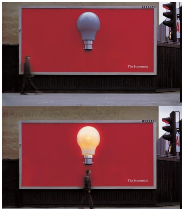
Equipped with motion sensors, these innovative campaigns light up whenever a person goes under them. The motion sensor would be triggered under the lightbulb and illuminate the bulb. This essentially implied that anyone who read The Economist would be enlightened.
Nike
Nike has had numerous successful marketing campaigns over the years. This athletic brand clearly understands the market it caters to and makes sure to adapt its advertisements locally for the best results. For instance, this advertisement would not work so well in any other country but Canada, where it was originally displayed. The caption reads, “Ready for your:45?” and represents the average time a hockey player passes on the ice each shift.
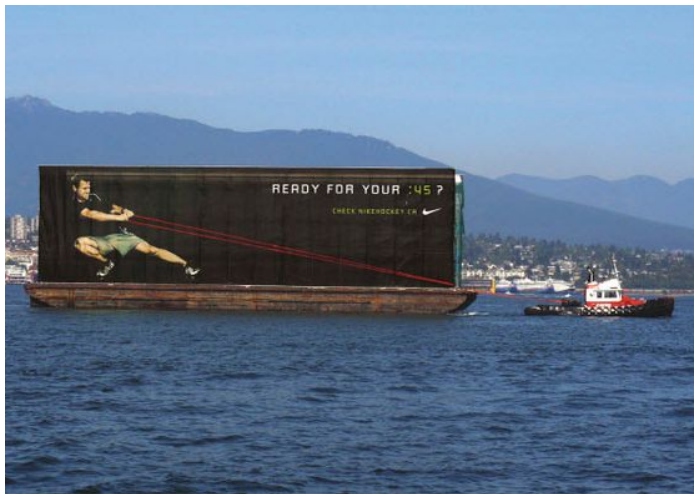
With a strategically placed boat, the billboard gives off the illusion of being pulled by a tugboat. However, the image states that the man is pulling the tugboat, not the other way around. Simply put, he has been training while wearing his favorite Nike gear.
Adidas
Sports bring people together, making this one of the superior ways to connect with the audience. The best part of this advertisement is that it relies on simple visual elements, devoid of words, but still manages to push the message well. Adidas displayed this billboard before the 2008 EuroCup soccer tournament started in Vienna. Stationed right in front of the famous Prater Ferris wheel, it shows a man in a goalie uniform.
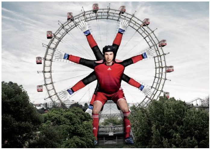
He is Petr Cech, the goalkeeper from Czechia. Thanks to the clever positioning, viewers will be forced to think Cech supports the Ferris wheel, not the intricate mechanisms holding the ride together.
UTEC
Not all billboards are made as a part of a detailed marketing campaign only looking to benefit the company. Some are designed to solve a problem, like this one. In Lima, Peru, people were suffering due to a shortage of drinkable water. UTEC, the University of Engineering and Technology, partnered with an ad agency to create this unique billboard that could produce potable water from the air’s water vapor. Within its first three months of operation, the billboard produced over 9,000 liters of drinking water.
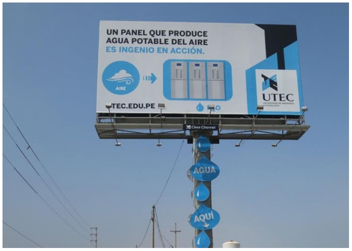
Innovations like these save lives. This design was conceived when the university wanted to open its applications for 2013. They wanted to attract the students’ attention. We would say they did that pretty well.
British Airways
Another example of a brilliant moving advertisement, this billboard from British Airways, can be found in Piccadilly Circus, London. Once operational, the ad starts with a little boy sitting on the ground. He knows when there will be a plane from the airways flying over and whenever that happens, he stands up and runs after the aircraft. The advertisement provides the number and destination of the plane when the boy is out of the screen for a few seconds.
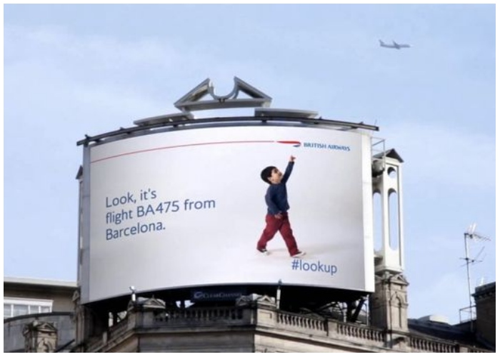
Their slogan, “More flights, More destinations,” comes next. At this point, the aircraft has left the vicinity, and the child can be seen walking back to his spot. Of course, they had to add their website information at the end to wrap it up.
Orphea
Pesticide company Orphea wanted to show people how powerful their insect sprays are. They chose a time when flies and mosquitoes had risen greatly in number. To create the unique ad, they neatly transformed a regular billboard into a big insect trap. Albeit a bit gross, the results were great. It could easily capture the attention of many Brits who were utterly fascinated by the mechanics of the advertisement.
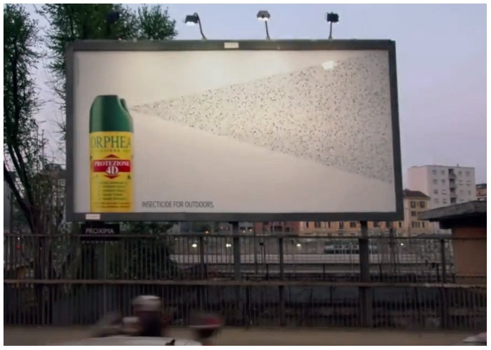
On a plain white canvas, a can of Orphea pest spray was printed vertically. Glue was applied strategically to the canvas. Astream of colors would make viewers think pesticide was coming out of the can. After a long time-lapse, we can see thousands of mosquitoes and flies stuck to the sticky bits.
Apolosphy
In a subway in Stockholm, passengers were subjected to a captivating visual illusion when the hair care brand Apolosphy put up these digital billboards. Equipped with ultrasonic sensors monitoring train timings, the digital screens showed a woman with long, luscious hair smiling. She could tell when the train was arriving, but not in the conventional way everyone was thinking about. Whenever the train approached, the motion sensors would trigger the second part of the ad, sending the woman’s hair flying around in the wind wildly.
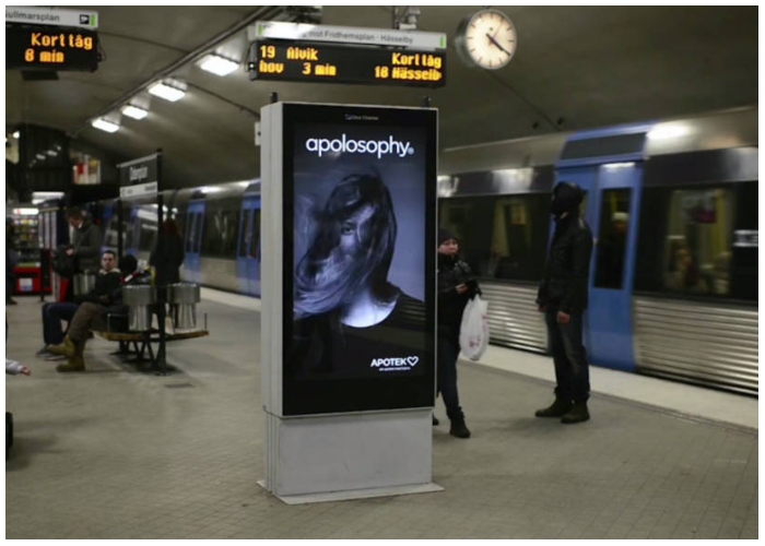
As the train comes to a stop, so do her blowing tresses. She flattens her hair and beams at the viewers, who are obviously pleased with the concept. The advertisement ends with the company’s slogan: “Makes your hair come alive.”
Audi & BMW
German brands BMW and Audi seem to be engaged in a lifelong battle where one tries to get the upper hand on another, only to realize they have met their true match. It all started when Audi, filled with bravado and bratwurst, posted a billboard advertisement for its new A4 line with the line, “Your Move, BMW.”
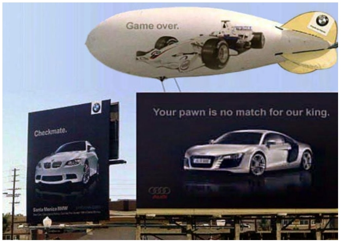
Cheekily enough, BMW fired back with a simple yet uber-confident one-liner: “Checkmate.” Audi was not going to give up that easily. Right next to BMW’s advertisement, they put up another billboard with the headline, “Your pawn is no match for our king.” In the next round, BMW brought out the big guns: the zeppelin.
Berger Paints
Well-conceived advertisements are a great source of buzz marketing. Done right, billboard ads can generate the right attention, giving the brand some much-welcomed traction. Berger Paints showed viewers the smoothness and range of their paint line with this innovative ad. Instead of a rectangular poster on a billboard, the advertisement taps into the magic of an optical illusion. Viewers see a painter hanging off the top of the billboard, holding his paint roller in one hand. He seems to be painting the white canvas the same color as the sky.
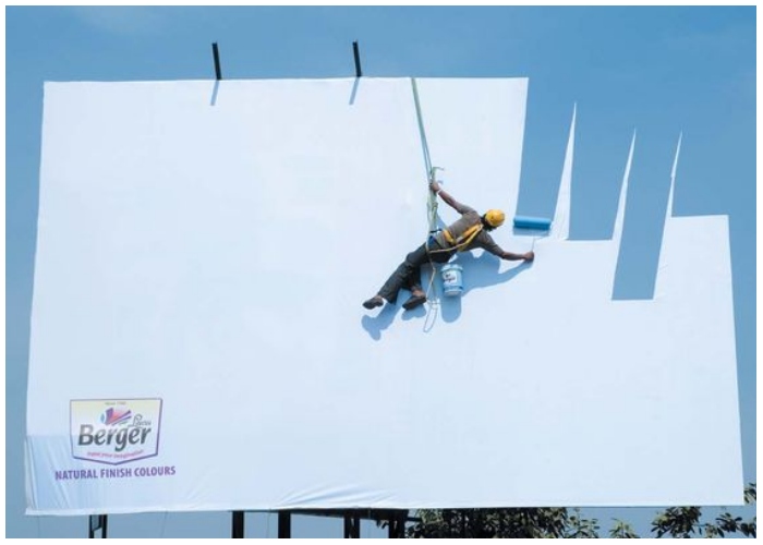
Low and behold, the sky and the paint are a perfect match. This cleanly drove their message of natural colors across the mass as people were left wondering how they did that.
Hot Wheels
Mattel isn’t only famous for its blonde Barbies; Hot Wheels is one of the company’s most loved branches. The scale model cars brand has been around since 1968 and delivered unadulterated automobile fun to millions of households worldwide. However, these toys might be losing relevance with technological advancements and the widespread availability of digital gadgets. Their target audience may start disparaging the brand by saying they are toys for children. Hot Wheels’ marketing team came up with the best answer for that.
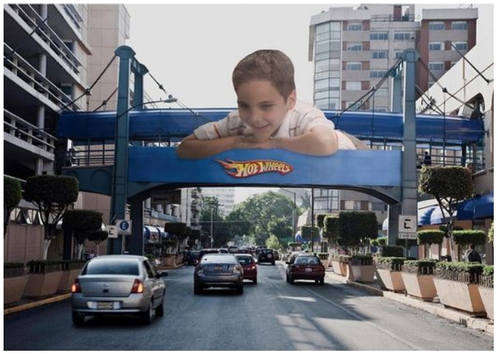
Hanging on an overbridge over a busy street, the advertisement shows a keen boy looking down at the cars crossing underneath. The brand’s logo is positioned right below the boy’s arms. Their message was clear: these were toys for big boys.
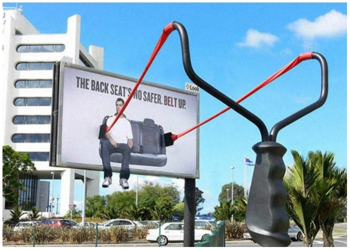
Mumbai Traffic Police
Instead of vocally urging people to wear their seat belts when driving, Mumbai Traffic Police resorted to a simple yet powerful ad to stress the topic of safety. To exhibit the importance of seat belts, the advertisement came with basic visual elements and a three-word phrase. A full-sized billboard was hung slightly from an angle. It was held back only by a huge seat belt. The message “Seat Belts Save” was printed on its sides.
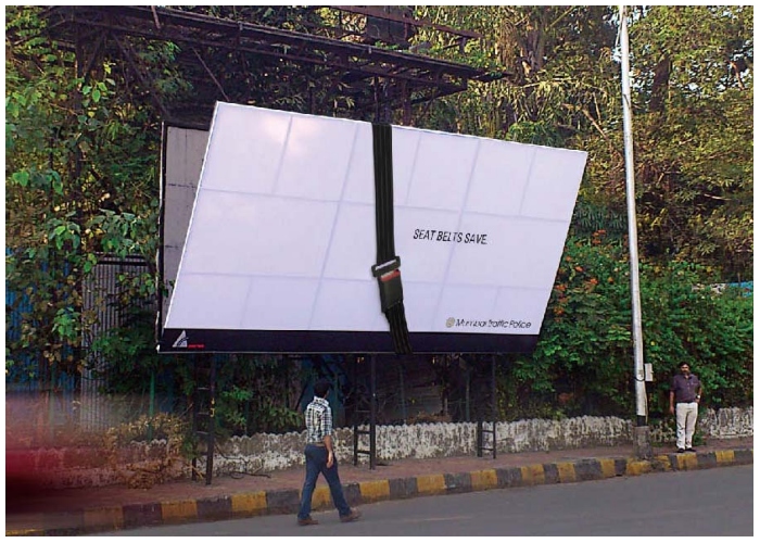
Across the globe, we lose many lives to traffic accidents each day. Disturbingly enough, a huge number of these incidents can be prevented by wearing seat belts—no better way to warn the public than by giving a visual demo.
McDonald’s
There is one other thing that’s highly popular, aside from the Big Mac from the largest fast-food chain in the world, McDonald’s. Fries! When we think of McDonald’s, we think of its signature red and yellow package holding a handful of long, lean, crispy golden fries. For this marketing campaign, McDonald’s chose to take to the roads instead of a high billboard in the sky. They wittily selected an average zebra crossing and painted the white stripes yellow. Underneath the stripes, the fry box of the brand was drawn.
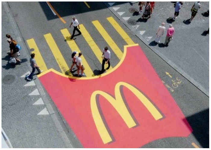
Anyone seeing from the top or sideways could tell this was a McDonald’s’ ad. The company did not have to use words because most people are already familiar with their yummy fries. People would look at the advertisement and subconsciously crave fries before looking for the nearest McDonald’s.
Tropicana
Juice brand Tropicana has come out with many entertaining ads over the years, some more engaging than others. Example: the K-pop artist JooE dancing aggressively with a bottle of Tropicana while singing “Tropicana” at the top of her lungs. For this one, they needed to return to their roots and bring out the essence of their brand – literally. Hundreds of juicy, plump oranges were fixed on a board filled with pins. They were hooked up to electrical wires, and the billboard was almost done.
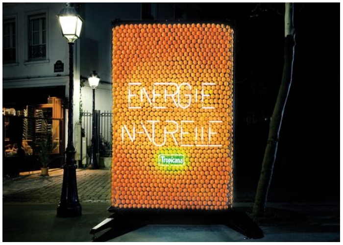
With Tropicana’s name glowing in neon lights at the edge of the advertisement, the billboard read: ENERGIE NATURELLE, French for natural energy – Tropicana’s key selling point.
Ricola
Ricola makes Swiss herb drops, and the company claims their bonbons contain a combination of 13 natural herbs to deliver instant relief to strained throats. This effect was visualized with the help of these creative candy wrappers. The company did not have to spend additional funds on an elaborate marketing campaign because their candy wrappers seem to do the job equally. Before the bonbon is opened, the wrapper is twisted on both ends.
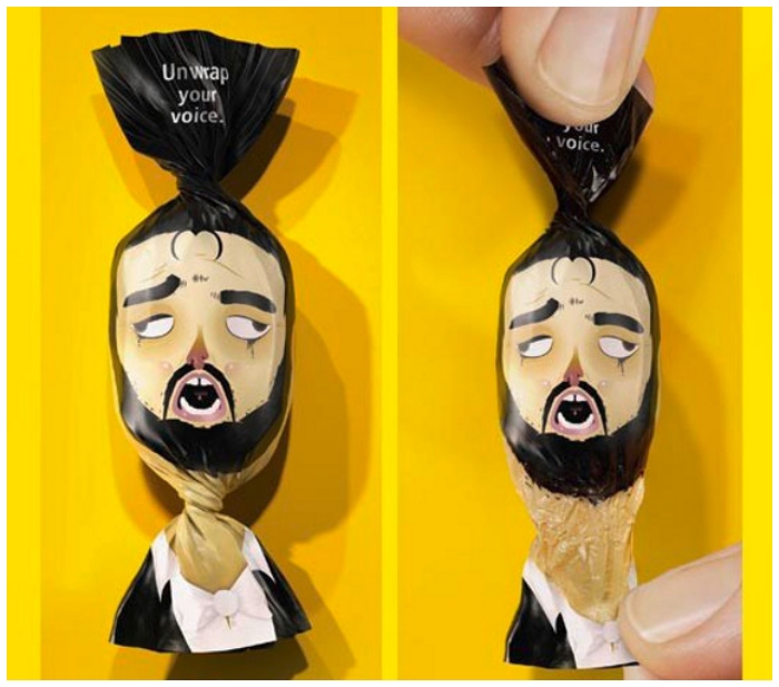
On one end of the twist are the words, “Unwrap your voice,” while on the other, we can see a character’s neck extending. The twist is supposed to symbolize a strain in their throats which is cleared up once the candy is opened.
Powerhouse Gym
Powerhouse Gym’s marketing campaign featured the image of a bodybuilder with his hands placed in such a way that they create an amusing visual effect. Industrial grade crane cables were used as props for fly-wires and around the two buildings where the ad was displayed.
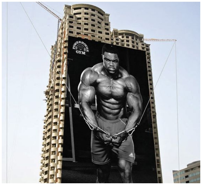
On top of getting the most out of these cranes, which would restrict the billboard any other way, it also tricked viewers. They were made to believe the bodybuilders were pulling on the cranes, not their everyday gym equipment. Their goal was to demonstrate how ripped customers can get at their gyms.
Papakura District Council
Traffic accidents cause destruction to lives and property. Accidents happen on dry roads enough for people not to cause chaos on wet roads. Driving conditions certainly worsen when the roads are slippery, and the tires do not experience as much friction against the driving surface. Papakura District Council came up with a saddening billboard that would react to the rain to encourage people to drive safely in the rain.
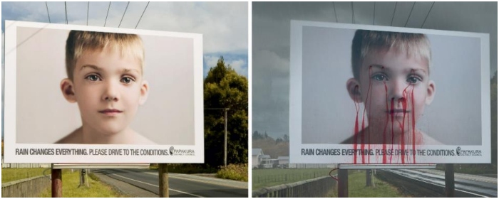
The moment water touches the billboard; the boy is seen to be hurt, blood gushing out various parts of his face. A message runs under the boy’s face saying, “Rain changes everything. Please drive to the conditions.” We should all remain careful while driving. One accident can harm many.
Nike – Run Again
Safe to say, we are all acquainted with Nike’s slogan: Just Do It. However, the slogan was changed recently to “Do It.” Whether the average viewer sees it as a bullying command or a motivational rallying cry, it is difficult to avoid this slogan in modern life. Coupled with the brand’s familiar swoosh, the message easily penetrates minds and helps people recall them whenever they see the logo. In another attempt to popularize an authoritative advertisement, this marketing campaign removed the seats from park benches.
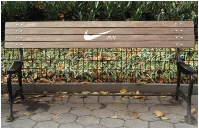
Nike’s slogan stayed on the backrest with a clear message for people to keep running. The brand wanted to remind viewers to ditch rest for a while and keep working.
Miele
The average homeowner may not be familiar with Miele, but it is a pretty big deal in its home country of Germany. The German manufacturer produces luxury commercial and domestic appliances. Harnessing the smartness of Mayer/McCann Erickson, they made something out of nothing. It started with a mundane tunnel in Slovakia. It was digitally improved by adding a billboard on top. The tunnel’s design fits the product description perfectly – a Miele S8 vacuum cleaner – spreading the “Monster Suction” agenda.
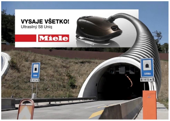
From afar, it would look like the vehicles were getting sucked into the tunnel. The words “Vysaje Vsetko” are Slovakian for “It just sucks all out.” Pretty neat for a vacuum advertisement (pun intended).
Panasonic
Clever use of environmental clutter helped increase this advertisement’s impact. This ad would not make sense if the cables were not joined densely at the pole like that. The Japanese company, Panasonic’s nose hair trimmers gained much attention following this marketing stunt. The billboard was smartly positioned between a cluster of power lines. A bald character was chosen, and his nostrils were designed at the joint of the lines.
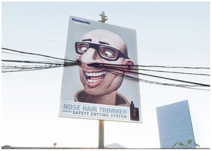
As the long cables extended in different directions, people were presented with the illusion of disgustingly long nose hairs. And of course, the perfect solution to that would be a sharp nose hair trimmer from Panasonic. Ingenious!
KitKat
KitKat’s “Take a break, have a KitKat” slogan was so funny and catchy that it broke boundaries, perpetuating pop culture references. That time, a fan connected the chocolate and one of the most famous breakups in TV show history, Ross and Rachel from FRIENDS. Ross tried to make up for allegedly cheating on his girlfriend by claiming they were on a break. Similarly, this bench promoted the chocolate bars smoothly (perhaps as smooth as the chocolate itself).
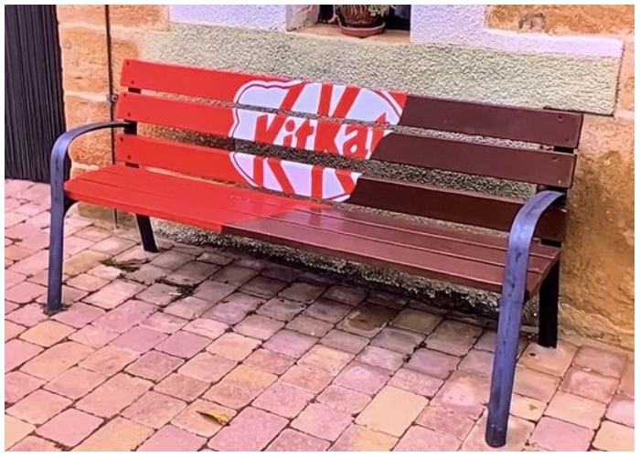
They chose an unassuming park bench and colored it to the exact shade of KitKat.. The chocolate wrapper was drawn on the other end but kept to 2/3rd of the bench to replicate the effect of open chocolate.
The Kraken Black Spiced Rum
Many legendary creatures only exist in mythology and folk tales. The Kraken is supposed to be an enormous sea monster lurking on the coast of Norway. Although there have been many “sightings” of the beast, there is a lack of conclusive evidence ruling in favor of its existence. Doesn’t matter! We can still catch a glimpse of the gigantic beast through the promotional billboards of Kraken Black Spiced Rum. Painted on the side of an exposed-brick building, the ad shows the Kraken in action with a drink bottle.
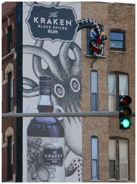
And naturally, since the Kraken has been released, it can be expected to cause chaos. We see chaos in the form of a man being choked between the slippery beast’s tentacles.
Koleston Naturals
Thankfully, we are not in the ’60s anymore, where it was considered hip to have hair colors that are visibly not blended together. Today, natural, sun-kissed hair is the trend. Hair color brands are pushing the agenda of “Natural mixes” that deliver a nourishing experience to the hair through the dyeing process. Koleston Naturals takes the cake for the best hair color advertisement there is. From the placement of the billboard to the overall implementation, everything is “naturally beautiful.”
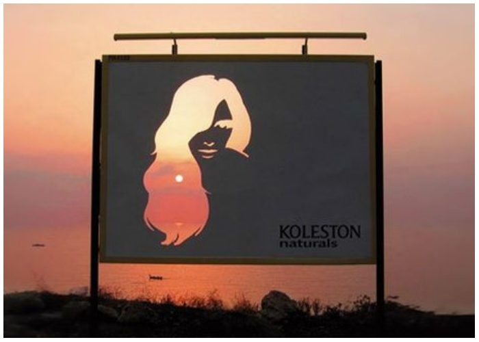
Overlooking the lake, a billboard was placed on a cliff. A woman was cut out onto the billboard. Every time the sun would rise, its warm rays would come through the gaps in the billboard, making it seem like the woman had perfectly golden hair.
Kleenex
From the name itself, it is easy to understand which industry Kleenex functions in. They mainly create paper-based products, and this mobile advertisement was for one of their facial tissues. The vinyl graphic shows a man blowing his nose into a facial tissue. The latter can be seen dangling off the van when the vehicle is static.
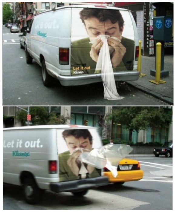
However, when the van started moving, the cloth would fly in the air, showing the real-life effect a nose blow has on a piece of tissue. This vinyl print and car adhesive design seamlessly showed how the tissue keeps the man clean after he is done blowing his nose rather hard.
Natures Plus
Hair fall is amongst the most common cosmetic concerns in the world. Young and old people alike suffer due to premature hair fall. As hair is considered one of a person’s most attractive aspects, they will surely be worried if they see signs of it falling out. Natures Plus came up with an inventive method to show people how they would be there for them to solve their hair problems.
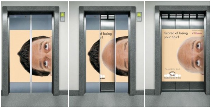
Instead of going for a billboard, they chose to advertise on an elevator. While closed, the elevator would show a man with thick locks. The face of the man is printed horizontally. However, once the elevator doors opened, it would reveal the balding condition of the man with the message, “Scared of losing hair?”
The Drybar
California-based salon chain Drybar provides one hair styling only: blowouts – and they are pretty good at it. Most people in the US are aware of the brand as it has existed since 2008. They have an established position in the market, but that does not mean they cannot launch a brilliant marketing campaign to bring more people through the salon gates. This particular one, Warm Wishes, was done in the colder months.

A huge gift box was placed in the middle of the roads with an even bigger hair dryer connected to it. What was interesting was how the hair dryer was upside down. Whenever someone came close to it, they could enjoy the warm air blowing through the dryer, similar to what they would experience while getting a blowout.
Colorado State Patrol
An inventive billboard from Colorado State Patrol successfully garnered public and media attention for its unique storytelling. The billboard read: “Tailgating Isn’t Worth It. Give Trucks Room. It’s The Law.” Adding a visual element to the advertisement, an automobile was shown colliding with the rear end of a large truck. The picture takes up the whole of the billboard and makes an equally large impact. What made the hoarding stand out was the way the crash seemed to have damaged the advert surface.
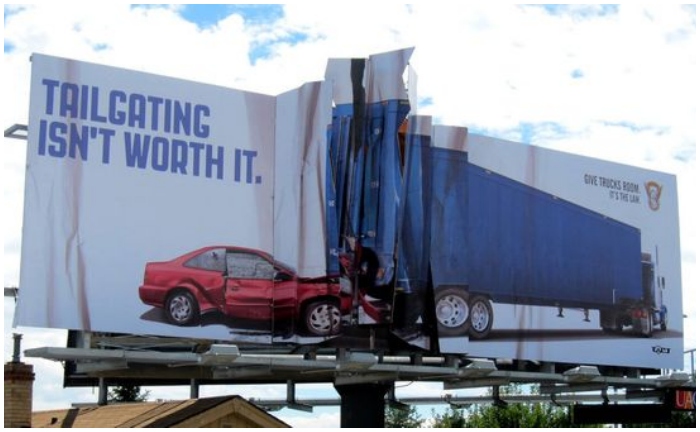
The billboard surface is torn and pleated at the point of impact, even pulled at some corners. It goes without saying that this hoarding from Colorado State Patrol was a smash hit.
Coca-Cola
Coca-Cola will land multiple spots if there is ever an advertising Hall of Fame. The beverage company comes forward to set the standard for ingenious marketing tactics, and they rarely fail. This one, for example, perfectly demonstrated how Coca-Cola could use simple visual effects to make an impact 10 times the size. Hung on the side of a building, the billboard shows a large bottle of Coke at its center. From it, seven straws originate and connect to seven different windows.

The message reads, “refresh on the Coca-Cola side of life.” We find it fascinating how they merged the original exterior shade of the building into the ad’s canvas.
Ariel
Ariel is to Europe and Asia as Tide is to the US. For those who do not know, this detergent brand comes from the P&G European Technology Centre in Belgium. One of their best advertisements comes in the form of a “super soft” billboard. Ariel wanted to demonstrate how soft clothes become once they are washed with the detergent. The hoarding seems to have almost melted, folding up against the edge of the billboard.
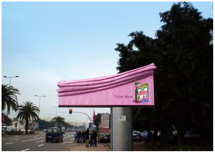
People who see this ad will wonder how soft the detergent must be that even the billboard became like that. A simple message on it says, “Super doux,” which is French for “Super soft.”
Anando Milk
Straight from the streets of India comes this intelligent advertisement that was designed to be larger than life and has an impact on its size. Most kids despise milk. Many of us recall having to argue our ways out of drinking milk when we were younger. Milk is quite important for child development. Anando Milk, a brand of flavored milk from the land of Bollywood and iconic monuments, decided to tap into a child’s innate world of fantasy.

The concept was to overstate the advantages of consuming milk. They wanted to make children think milk could give them superpowers and make them strong enough to move buildings.
Lifebuoy
The recent pandemic was a burning reminder of how humans need to be more mindful of personal hygiene. Our hands are the greatest inlets for germs into the body. Under these circumstances, there is no alternative to washing hands when needed. In order to enhance personal hygiene, Lifebuoy, the famed soap manufacturer, launched their “You Eat What You Touch” campaign. The ad shows a loaf of bread that transforms into a puppy after it has been touched by dirty hands.
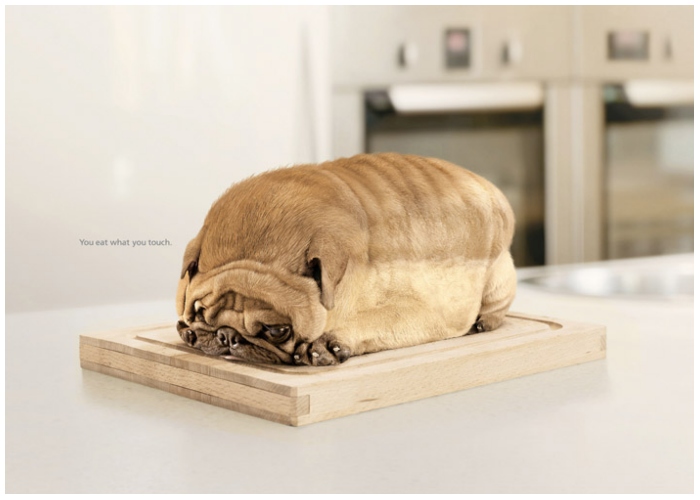
Consumed by their love for their pets, people often forget to wash their hands after playing with their animal companions. As a result, they are exposed to tons of germs. This ad would motivate them to wash their hands before eating.
Ricola’s Cough Advertisement
Ricola enters the list for the second time with yet another genius campaign. For this one, it takes inspiration from one of the more common concerns of people in relationships: their significant other’s best friend of the opposite gender. After all, there have been too many instances when the best friend turned out to be a hidden paramour. A funny take on what happens when a man has to introduce his “friend” to his lover, the ad emphasizes realizing the tone.

The “cough” in the sentence may convey the wrong message that something illegitimate is happening between the guy and his friend. When in reality, it is a cough caused by a sore throat. Avoid such problems by soothing a cough with Ricola.
Barilla
Simplicity and minimalism at its finest, this advertisement from Barilla won hearts all around. Barilla is the largest pasta producer in the world and was established in 1877 in Italy, thus their tagline, “The choice of Italy.” This promotional campaign took place during the festivities of New Year. This is the time when the sky is lit by thousands of fireworks around the world to celebrate the bright start of a new year.

The company found a stark resemblance between how a firework looks once it explodes and strands of uncooked spaghetti. Positioned properly, the spaghetti took on the appearance of a beautiful, golden firework. A grand way of wishing their consumers a Happy New Year.
Tabasco Pepper Sauce
It’s time for a hot and spicy addition to the list! Tabasco Pepper Sauce is a fan favorite for its spicy taste. The sauce is a common ingredient in restaurants and fast-food chains alike. Not only the taste but the aroma of this hot sauce is alluring. This advertisement perfectly depicted the spiciness of their sauce with basic visual elements.
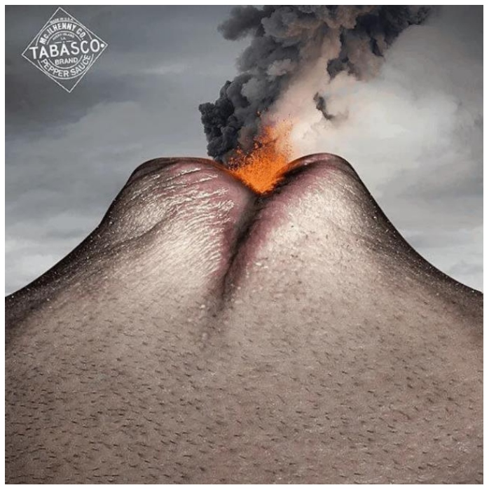
It showed a man who had consumed Tabasco Pepper Sauce and started emitting lava, similar to what a burning volcano would do. The man’s face replaces the body of the volcano, with smoke and fire emitting from his lips. Many would think this ad is a bit too extreme, but some people genuinely enjoy the mouth-numbing spiciness of this sauce.
McDonald’s – I’m Lovin’ It
McDonald’s has entered the list for the second time; this time, the advertisement is better. The fast-food company caused strides in the industry when it launched its promotional campaign. Marketers everywhere were vehemently praising the advertising agency for coming up with something interesting. At first glance, the advertisement may give the wrong idea. We would be fools to think that the two people in the ad are only inches away from locking their lips.
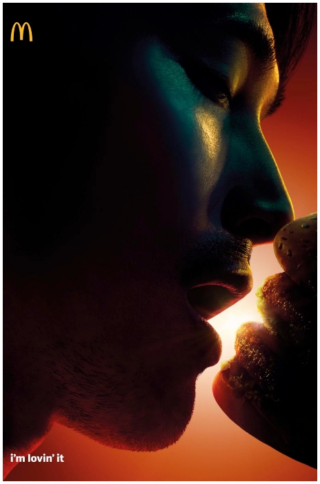
Observed closely, the ad reveals the “second mouth” to be a burger. So the man was never aiming to kiss his lover; he was going in for a bite of the delicious burger from McDonald’s.
Chupa Chups
Brands try to come up with marketing campaigns during special occasions. One such instance when candy and chocolate brands thrive is Valentine’s Day. The official day dedicated to the celebration of love is a perfect opportunity to have a sweet bite. Chupa Chups, a candy brand, created Love Pop, a two-sided lollipop with a short stem.
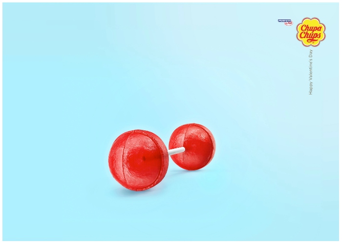
The idea was to allow couples to share a lollipop that ends with a sweet kiss. Brought out at the time it was and resonating with the hue of love, Chupa Chup’s Love Pop counts as a marketing masterpiece.